
Tiny tools, big learnings
What building small things has taught us about creativity, consistency and compound growth. Every project we shipped changed how we think about the next one.
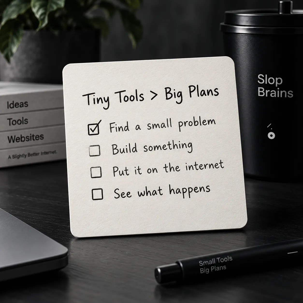
1. The first project changes everything
Before you ship the first thing, building for the internet feels abstract. You have ideas. You have opinions about design. You know what good websites look like. But you have never actually taken something from nothing to a live URL that strangers can visit.
The first project changes that. For us, it was QR Bench. A simple tool for generating and comparing QR codes. It took about four days to build. Nothing about it was revolutionary. But the moment it was live on a custom domain, something shifted. We had put a thing on the internet. A real thing, with a real address, that real people could use.
The learning from the first project is not technical. It is psychological. You learn that shipping is possible. That it does not require months of work. That an imperfect thing on the internet is infinitely more valuable than a perfect thing on your laptop. This realization sounds obvious when written down, but it only becomes real when you experience it.
Every builder we have talked to describes the same shift. Before the first project, there is hesitation. After it, there is momentum. The question changes from "Can I do this?" to "What should I build next?"
What QR Bench taught us
The specific lessons from QR Bench were practical and immediate:
- Scope is everything. We originally wanted to build a full QR code management platform with saved codes, analytics, and team features. We cut it down to one page: paste data, choose options, download the image. That decision took the project from "months of work" to "a long weekend."
- Edge cases matter more than features. The most important work was not the QR generation itself. It was handling empty inputs, extremely long text, special characters, and the differences between how browsers handle canvas downloads. The boring work is the important work.
- Real users behave differently than you expect. We assumed people would use QR Bench for payment codes and URLs. The most common use case turned out to be event organizers generating QR codes for Wi-Fi passwords. We never considered this.
2. Constraint is the most creative force
Every Slop Brains project operates under the same set of constraints. No backend. No user accounts. No database. Static files served from a CDN. These constraints are self-imposed, and they are the single biggest reason we can ship as fast as we do.
When you remove the backend, you remove 80% of the decisions. There is no authentication flow to design. No API to version. No database schema to migrate. No server to monitor at 3 AM. The entire surface area of the project shrinks to what the browser can do alone.
This sounds limiting, and it is. That is the point. Constraints force creativity because they close off the easy paths and make you find better ones.
Examples of constraint-driven creativity
slang.fyi without a database. A dictionary site seems like it needs a database. Thousands of entries, definitions, examples, categories. Our version uses a static JSON file that gets baked into the build at compile time. The search runs client-side with a simple filter function. It handles 3,000+ entries without noticeable delay because modern browsers are fast and JSON parsing is cheap.
The constraint (no database) produced a better outcome (instant search with no network requests) than the "obvious" solution would have. Every query is answered by the data already in the browser. No loading spinners. No failed requests. No API rate limits.
The contact form without a backend. Every Slop Brains project has a "Build with us" button. Without a backend, we cannot send emails or store submissions. So instead, the form generates a plain text file that the user downloads. The brief stays on their device. Nothing is sent anywhere.
This is arguably better than a traditional contact form. The user keeps their own copy. They do not have to trust that we will handle their data responsibly. There is no GDPR compliance to worry about because we never touch the data in the first place.
The quiz without a server. The "Find your side quest" quiz on our How It Works page generates a result code like SB1-012. This code encodes the user's three choices as digits. It can be shared, compared, and decoded entirely in the browser. No server stores any results. No session tracks any user. The code itself is the data.
Why constraints work
There is a reason that poets write sonnets and haiku instead of free verse all the time. Constraints give structure. They reduce the space of possible decisions from infinite to manageable. When you can use any technology, choosing one is paralyzing. When you can only use HTML, CSS, and JavaScript, you just start building.
The constraints also create consistency across projects. Every Slop Brains site has the same fundamental architecture: static files on a CDN. This means the skills transfer perfectly. The deployment process is identical. The debugging approach is the same. We never have to context-switch between different tech stacks because there is only one stack.
3. Finishing is a skill
Starting projects is easy. Ideas are exciting. The first hour of building is pure energy. You can see the shape of the thing. You know what it should become.
Then you hit the middle. The part where the exciting work is done and the boring work begins. Empty states. Error handling. Mobile layouts. Accessibility. The favicon. The meta description. The Open Graph image. The 404 page. Each one is small. Together, they take longer than the entire initial build.
Most side projects die in the middle. The builder loses interest, finds a new idea, and starts something else. The graveyard of unfinished projects grows. We know this pattern intimately because we have contributed to it many times.
The skill of finishing is different from the skill of building. Building is about making things work. Finishing is about making things complete. A working prototype is not finished. A finished project is one where every state of the UI is intentional, every error has a message, and every interactive element works on a phone.
Our finishing checklist
We developed a checklist specifically to get through the middle. Not the pre-launch checklist (that comes later). This is the "you are losing motivation and need a map" checklist:
- Test every input with no data. What happens when every field is empty? What does the page look like with zero results? Fix all of these.
- Test every input with bad data. Paste a novel into a search field. Enter emoji in a name field. Submit a form with only spaces. Anything a real person might do, intentionally or accidentally.
- Resize the browser to 375px wide. Does everything still work? Can you tap every button? Is all text readable? If not, fix it before anything else.
- Tab through the entire page. Can you reach every interactive element with the keyboard? Can you see where focus is at all times? Does the focus order make sense?
- Write the README. Explain what the project is, how to run it locally, and how to deploy it. If you cannot explain it clearly, the project might not be clear enough.
- Set the meta tags. Title, description, Open Graph image. These take five minutes and determine how the project looks when shared on social media.
By the time we finish this checklist, the project is genuinely done. Not "done enough." Done. The checklist turns a vague feeling of incompleteness into a concrete list of tasks, and concrete tasks are much easier to execute than abstract intentions.
4. Consistency beats intensity
We do not do hackathon-style building sprints. We do not pull all-nighters to ship something by an arbitrary deadline. We build in small, consistent sessions: an hour here, two hours there, sometimes a full Saturday afternoon when the energy is right.
The results of this approach are counterintuitive. In any given week, it does not feel like much is happening. An hour of work produces maybe 50 lines of CSS or one well-tested JavaScript function. But over months, those hours compound. One project becomes two. Two becomes five. Five becomes ten. The collection grows not because of any single burst of effort but because the effort never fully stops.
The two-hour rule
We have an informal rule: if a building session lasts more than two hours, stop. Not because the work is done, but because the quality of decisions degrades with fatigue. The CSS you write in hour three is worse than the CSS you write in hour one. The edge cases you miss at midnight are the ones that embarrass you in the morning.
Stopping is hard when you are in flow. The temptation to push through is real. But we have learned through experience that the project is better served by a fresh pair of eyes tomorrow than by tired eyes tonight.
Protecting the stopping point
The most important habit we have developed is writing a note before closing the laptop. Just one line: "Next: fix the search empty state on mobile" or "Next: add keyboard shortcut for Cmd+K." This note takes ten seconds to write and saves twenty minutes of context-reconstruction the next time we sit down.
Without the note, returning to a project after a few days means re-reading the code, remembering where you left off, and figuring out what needs to happen next. With the note, you open the file, read one line, and start working. The difference in friction is enormous, and friction is what kills side projects.
The compound effect of small sessions
Here is the math that makes consistency powerful. One hour per day, five days a week, for a year is 260 hours. That is enough to build and ship 8 to 12 small websites. Not prototypes. Finished, polished, deployed websites with custom domains.
Most people overestimate what they can do in a weekend and underestimate what they can do in a year. A weekend of intense work produces one half-finished project. A year of consistent small sessions produces a portfolio.
We are not disciplined people. We do not have a rigid schedule. Some weeks we build every day. Some weeks we do not build at all. But the average, over time, is consistent enough that projects keep getting finished. That is all it takes.
5. Users teach you what you built
There is a humbling experience that happens with every project: you build something for one purpose, and people use it for a completely different one.
We built protocols.page as a quick reference for developers who needed to look up how SMTP works or what the difference between TCP and UDP is. The actual audience turned out to include a significant number of students studying for networking certifications. They were not looking up individual protocols. They were reading every page in order, using the site as a study guide. We never designed it for that. But the content was structured in a way that happened to work perfectly for sequential learning.
slang.fyi was built for internet-native people who wanted a clean reference for terms they already half-knew. The actual audience includes a large number of parents trying to understand what their teenagers are saying. The most-viewed entries are terms like "no cap," "delulu," "rizz," and "slay." These are not niche internet terms. They are everyday language for an entire generation, and there was no good, clean reference for them.
The lesson: do not assume
The common thread in every "surprising use case" story is the same: we assumed we knew who would use the tool and why, and we were wrong. Not completely wrong. The intended audience does use the tool. But there is always a secondary audience that we did not anticipate, and sometimes that audience is larger than the primary one.
This has changed how we think about building. We no longer design for a specific user persona. We design for a specific task. "Look up the definition of an internet slang term" is a task. Who does it and why is not our concern during the build phase. If the task is well-served, the right audience will find the tool.
Feedback from the void
Small websites do not get much feedback. There are no comments sections. There are no review pages. Most visitors use the tool, get what they need, and leave without saying anything. This is fine, and it is how the web should work.
But occasionally, someone sends an email. Or mentions the site in a forum post. Or links to it from their blog. These moments are disproportionately motivating. A single email that says "I use this tool every week, thank you" provides more motivation than a thousand page views in an analytics dashboard.
We do not optimize for feedback. We do not add feedback forms or NPS surveys. But we make our email address easy to find, and when someone writes to us, we write back. Every time.
6. Simplicity is hard and worth it
The hardest part of building a small tool is deciding what to leave out. Every project starts with a list of features that is three times longer than what ships. The editing process, cutting features until only the essential ones remain, is where the real design happens.
QR Bench could have had: saved QR codes, batch generation, analytics on scans, team sharing, an API, premium tiers. It has: one input, a few options, and a download button. That is it. And that simplicity is exactly why people use it. You get what you need in under 10 seconds and move on with your life.
The temptation to add features is constant. Every week, we think of something that would be "nice to have." A dark/light mode toggle. A recently-used history. Export to multiple formats. Each feature is small on its own. But features are not additive. They are multiplicative. Each new feature interacts with every existing feature. A tool with 5 features does not have 5 things to maintain. It has 5 × 4 = 20 potential interactions to consider.
The one-job test
Before adding any feature to a shipped project, we ask: "Does this help the user do the one job they came here for?" If the answer is yes, we consider it. If the answer is "it would be cool" or "other tools have it," we skip it.
This test has prevented more bad decisions than any other principle we follow. It is easy to say yes to features. It is much harder to say no, especially when the feature would be fun to build. But every feature you add is a feature you maintain, document, test, and support. The cost of a feature is not the time it takes to build. It is the time it takes to maintain forever.
Simple does not mean easy
People sometimes mistake our simple tools for easy builds. They are not. Making something simple requires more decisions than making something complex. Complexity is the default. You just keep adding things. Simplicity requires active removal. You have to look at something that works and decide to take part of it away.
The design process for slang.fyi was mostly subtraction. The first version had: categories, trending terms, word of the day, user submissions, pronunciation guides, and etymology notes. The shipped version has: a search bar, a list of terms, and definitions. Everything else was cut because it did not serve the core task: look up what a word means.
We cut good features. Features that people would have liked. Features that would have made the site more engaging. But "more engaging" is not the goal. "More useful for the specific task" is the goal. Those are different things, and confusing them is how simple tools become bloated platforms.
7. Building creates identity
Something unexpected happened after the fifth or sixth project: people started to recognize Slop Brains as a thing. Not a company. Not a brand. A thing. A collection of websites with a consistent aesthetic and philosophy. The blue accent color, the dark backgrounds, the clean layouts, the dry copy. It became recognizable.
This was not planned. We did not sit down and design a brand identity. We just kept making things that looked similar because we were the same person making them with the same taste. Over time, the consistency became the identity. The collection told a story that no individual project could tell on its own.
The portfolio effect
A single small website is a curiosity. Ten small websites are a portfolio. The difference matters for several reasons:
- Credibility. Anyone can ship one thing. Shipping ten things demonstrates a pattern. It shows that the first project was not a fluke. It proves that you can finish things repeatedly, which is a rare and valuable skill.
- Range. Each project is slightly different. A QR code tool shows technical capability. A slang dictionary shows content thinking. A meme site shows humor and cultural awareness. Together, they paint a more complete picture than any single project could.
- Momentum. A collection has momentum that individual projects do not. Each new project gets a boost from the existing ones. People who found us through slang.fyi check out our other projects. The traffic is not large, but it is cumulative.
- Opportunities. People reach out with collaboration ideas, job offers, and partnership proposals because they see the collection, not because they saw one project. The body of work is the calling card.
Identity without branding
We want to be clear: we did not invest in branding. We do not have brand guidelines. We do not have a style guide document. We do not have a design system with named tokens and documented components. We just have taste that we apply consistently.
The logo is an SVG we made in 15 minutes. The color palette is three colors we liked. The typography is Inter because it is free and looks good. The name "Slop Brains" is a joke that stuck. None of this was strategically chosen. All of it, together, created something recognizable.
The lesson is that identity emerges from consistency, not from branding exercises. If you make things regularly and you have taste, the identity will form on its own. You do not need to design it. You just need to keep building.
8. What we got wrong
Not every lesson was positive. Some were learned through failure, and we think those are worth sharing too.
We undervalued content
Early projects focused heavily on the interface and barely on the content. The designs were polished. The interactions were smooth. But the actual words on the page were an afterthought. placeholder-quality copy that we planned to "improve later."
Later never came, and the projects suffered for it. A beautiful tool with unclear instructions is worse than an ugly tool with great copy. People read words. They do not admire CSS gradients. The lesson: write the content first, then build the interface around it.
We over-engineered early projects
The first version of protocols.page used React with a custom state management system, TypeScript with strict mode, a build pipeline with Webpack, ESLint, Prettier, and unit tests. For a site that displays static text about internet protocols.
The rebuild took three days and used plain HTML. The HTML version loads faster, is easier to maintain, and has zero dependencies. The lesson: choose the simplest technology that solves the problem. Not the most interesting technology. Not the technology you want to learn. The simplest one.
We compared ourselves to the wrong benchmarks
For a while, we measured our projects against commercial products. Why does our QR tool not have as many features as the paid alternatives? Why does our dictionary not have as many entries as Urban Dictionary? Why is our traffic not growing exponentially?
These comparisons are toxic because they apply big-company metrics to small-studio work. A commercial QR tool has a team of developers, a marketing budget, and revenue targets. We have one person and a text editor. The comparison is not just unfair. It is meaningless.
The right benchmark for a side project is the previous version of itself. Is this project better than it was last month? Are more people finding it useful? Are we learning from it? Those are the questions that matter.
9. The only real lesson: keep going
If there is one thing that building ten small websites has taught us, it is this: the most important thing you can do is keep going. Not in a hustle-culture, grind-every-day sense. In a quiet, persistent, "this is just what I do" sense.
The projects that succeeded were not the ones we were most excited about at the start. They were the ones we did not abandon when the excitement faded. The ones where we pushed through the boring middle, fixed the empty states, tested on real phones, and deployed even though it did not feel ready.
Readiness is a feeling, not a state. No project ever feels ready. You ship it anyway, and then you improve it based on reality instead of imagination. That is the process. That is the whole process.
We are going to keep building. Not because we have a grand plan. Not because the numbers justify it. Because building things for the internet is the most fun we know how to have with a computer, and we do not see any reason to stop.
"The best project is the next one. But only if you finish this one first."
Summary of lessons
- The first project breaks the psychological barrier. Ship something small.
- Constraints force better solutions. Embrace limitations.
- Finishing is a separate skill from building. Develop it deliberately.
- Consistency beats intensity. Small sessions compound over time.
- Users will surprise you. Design for tasks, not personas.
- Simplicity requires more decisions than complexity. Cut ruthlessly.
- Identity emerges from consistent output, not from branding exercises.
- Compare yourself to your past self, not to companies with teams and budgets.
- Keep going. That is the whole secret.